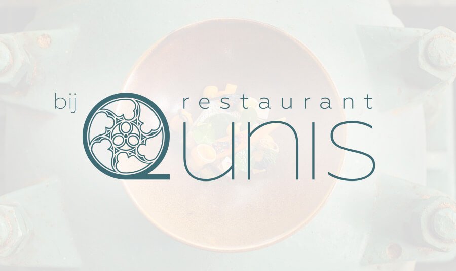
Bij Qunis branding
Branding, logo design, website
Branding, logo design, website
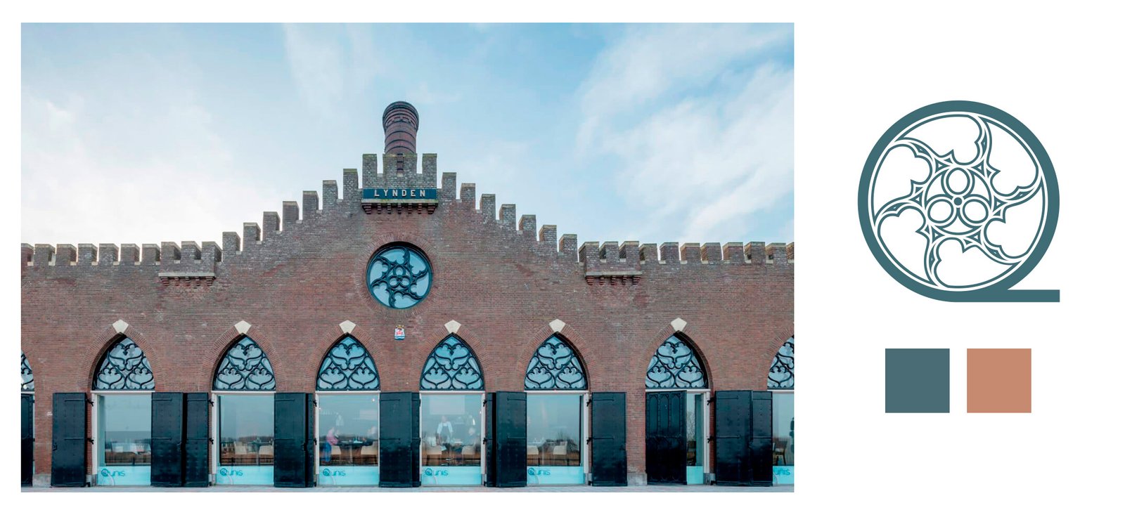
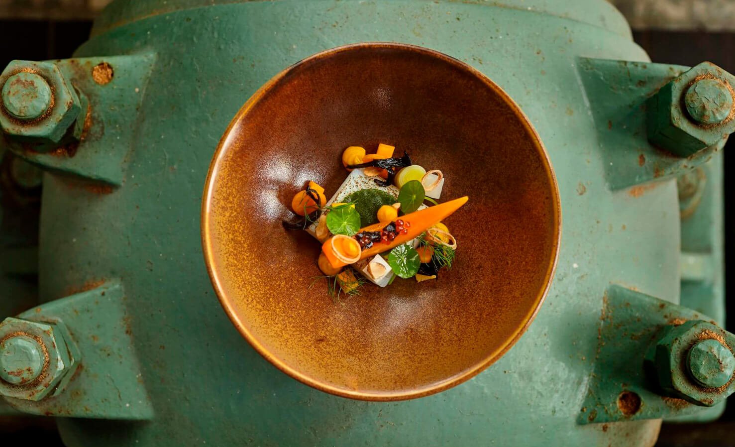
Restaurant Bij Qunis is a top Dutch restaurant led by chef Ronald Kunis. It is housed in the old pumping station De Lynden (1847), restored respecting its monumental character. Its Mediterranean cuisine, with fresh vegetables and seasonal products, aims at getting their first MICHELIN Star soon.
The name "Qunis" comes from the chef's last name Kunis. The letter Q stands for Quality, and the "bij" from Dutch "at", wants to make guests feel like at home.
The Challenge
Create a brand from scratch, along with deliverables like the website and stationery.
Target
Anybody who wants to experience good and honest food in an unique and historical place.
My role & responsibilities
As digital designer & developer I led the logotype creation and the website design and development. The team consisted of the creative director and 3 designers.
Logotype
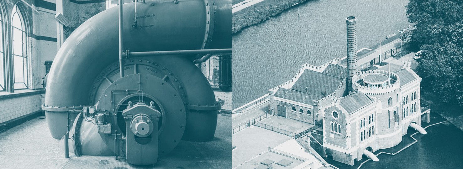
The building where the restaurant is located is a symbol of Dutch culture. They used the pumping stations to claim land from the sea and keep it dry. This is why I wanted to blend history and the experience of eating.
I was able to visit the place during restoration work. From there I picked the colours based on the original paint, and I got very interesting elements that inspired me to create the logo.
I noticed that there were many elements based on circular shapes: the pumping machines inside, the central part of the building, and the circular glass with metal decorations. Inspired by these, with the help of a graphic designer, we recreated the circular glass decoration and shaped it as the letter "Q" within the Qunis name.
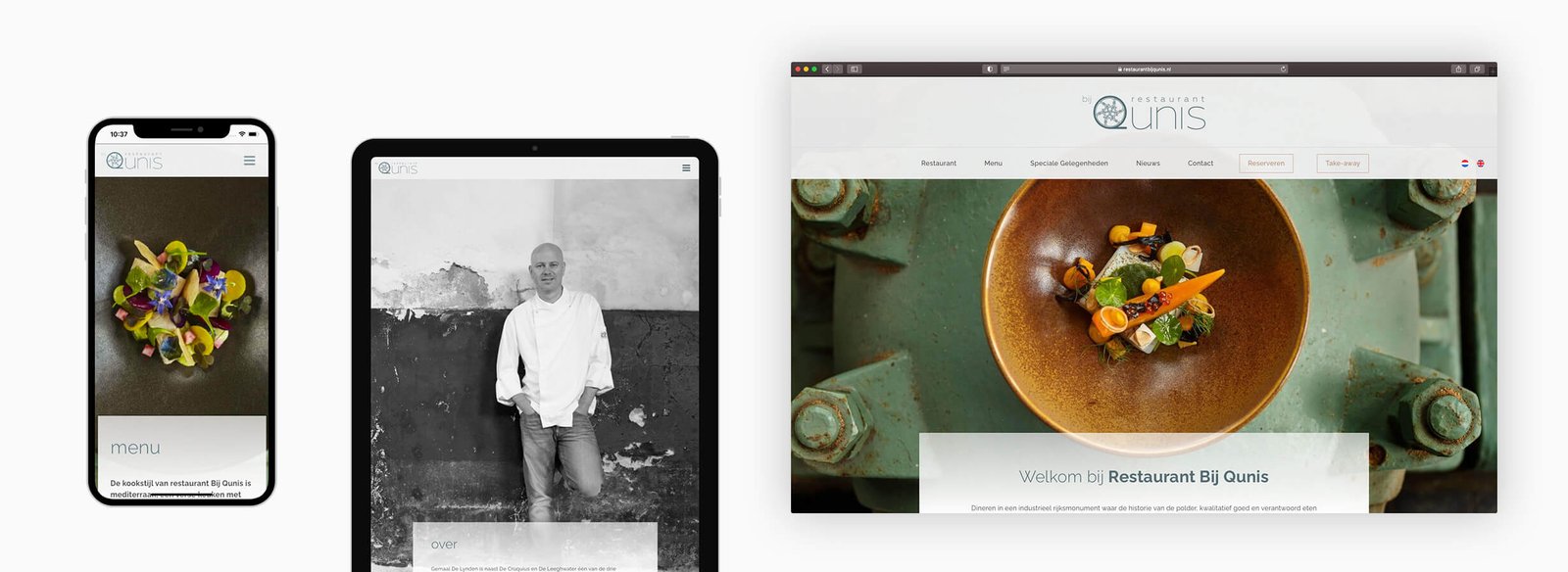
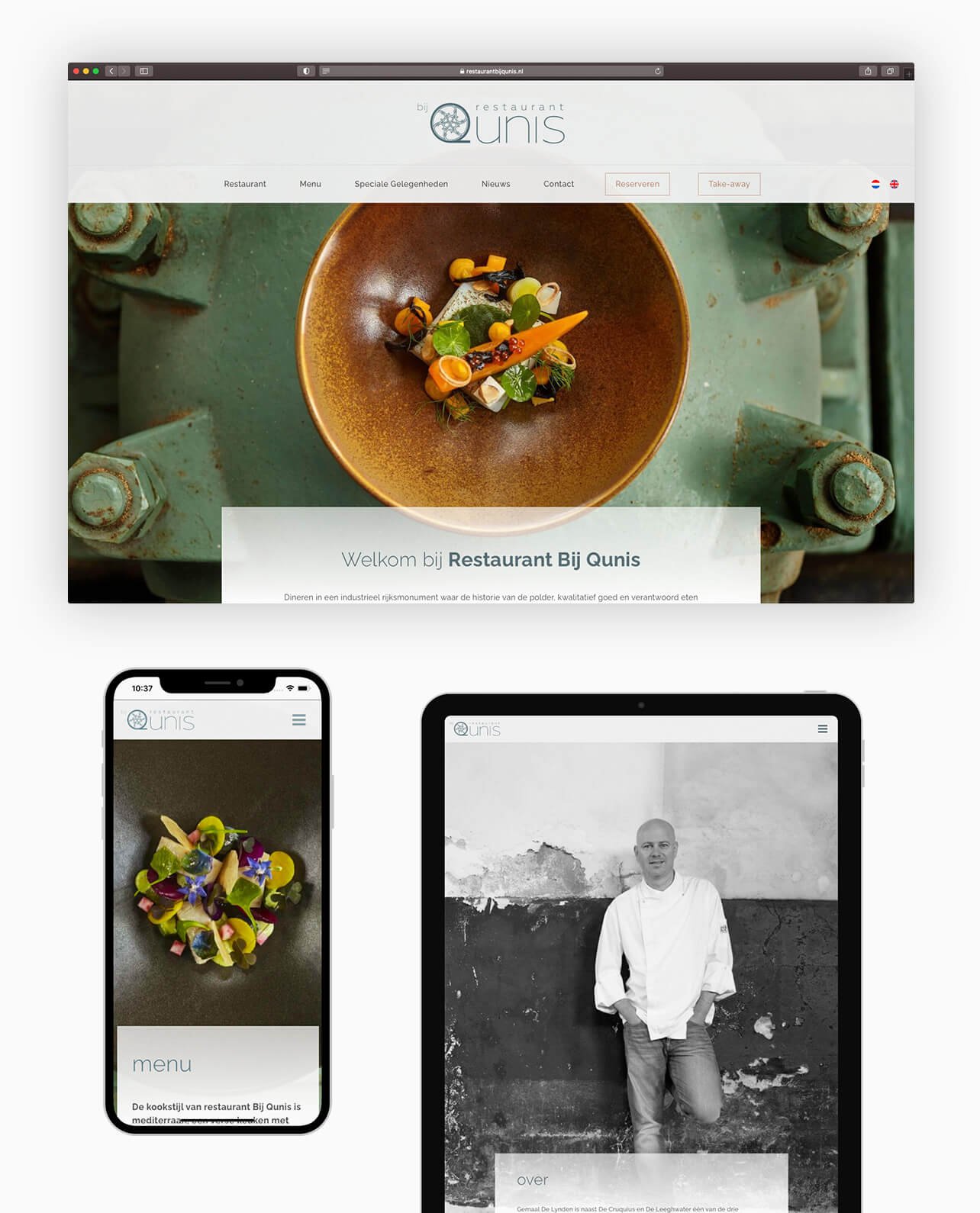
Website
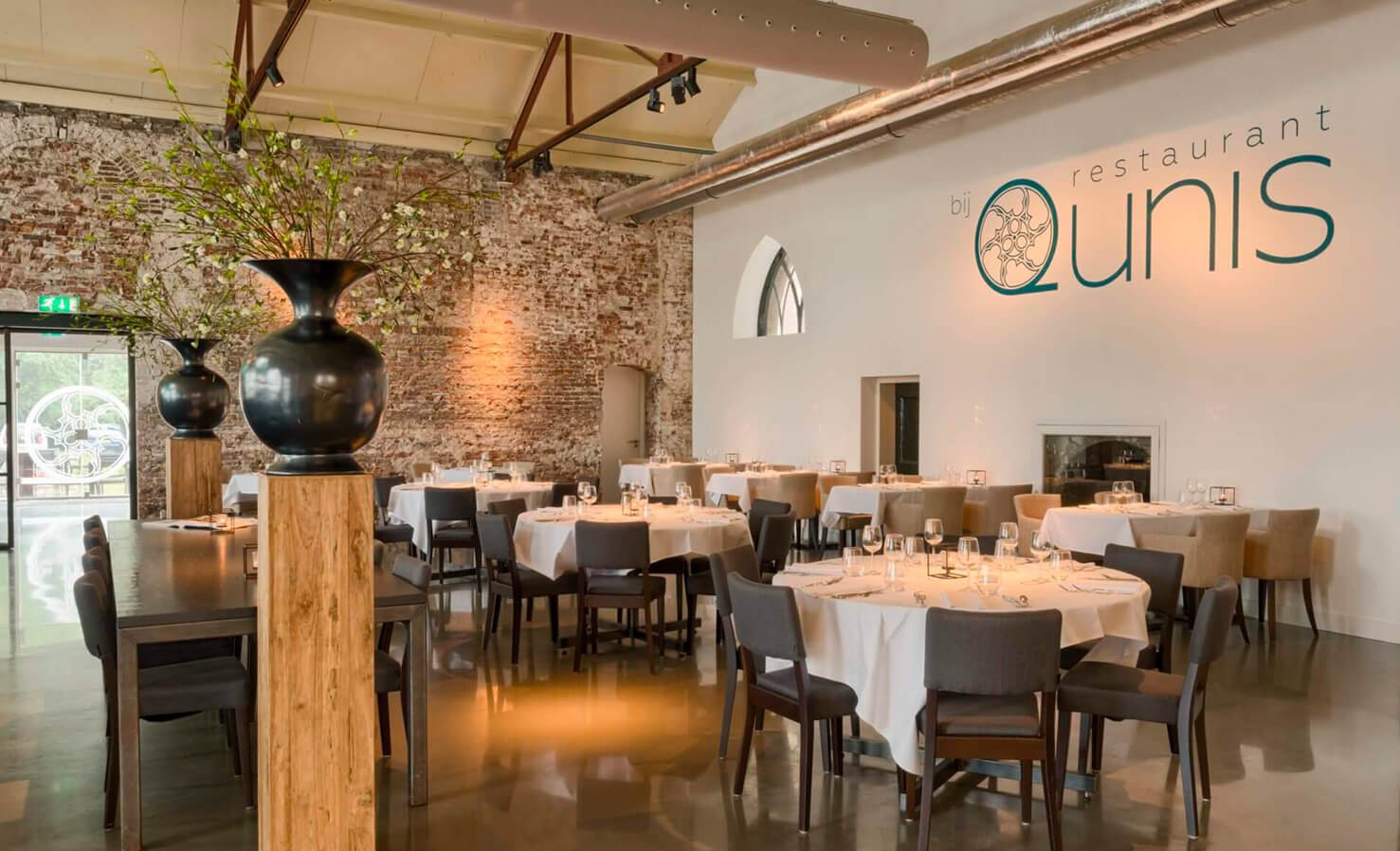
I designed and developed a custom theme using Wordpress. I chose this CMS because the client was already familiar with the system and they wanted to be able to edit and create content themselves.
Using big and bold visuals with a user-friendly content navigation, users are attracted by an industrial Look & Feel combined with beautiful and colourful dishes. The website has been fully tested and optimised for the most common browsers and devices, ensuring the best experience and performance.
Check the site live
selected from my work